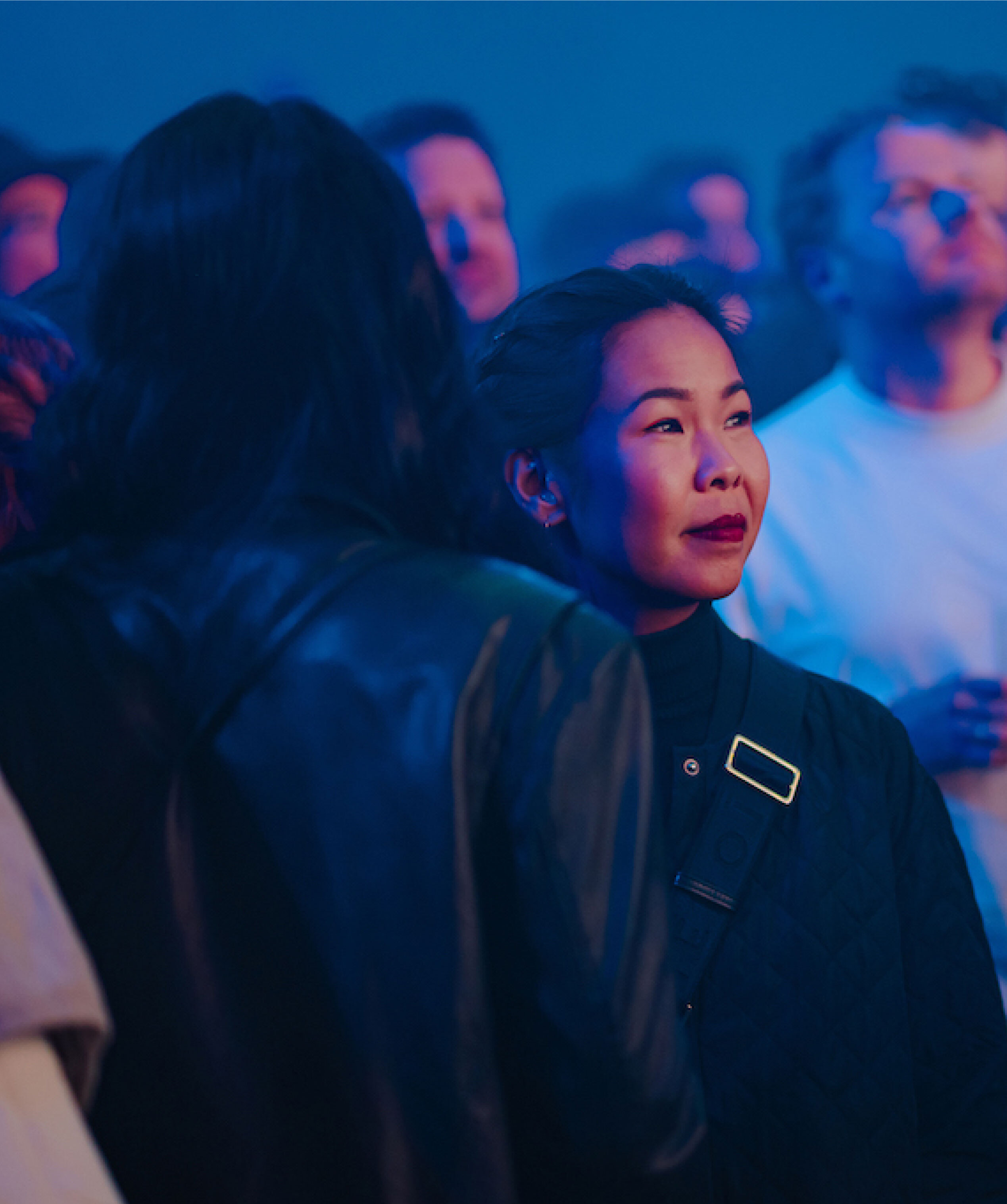
ABN AMRO
Designing BUUT, the next generation’s bank
( Services )
- Customer experience
- Tech & Data
Today’s teenagers grow up with Apple Pay, Venmo, and cryptocurrency as normal parts of life.
In this increasingly cashless world, a person’s savings are indicated by a number on a screen rather than the weight of their piggy banks. Yet financial literacy programmes still talk about balancing cheque books and counting change.
ABN AMRO recognised the uncomfortable truth: Money has gone digital, but financial education hasn’t caught up. As a result, banking’s traditional approach is both technologically and culturally incompatible with how young people think about money.
To create a banking experience that satisfies the needs of both digital-native teenagers and their parents, ABN AMRO partnered with Tikkie and DEPT® to build BUUT, a first-of-its-kind mobile financial platform.
Solving the banking puzzle
Today, most banking innovation typically builds off of existing systems, either making legacy platforms slightly more user-friendly or adding modern features to legacy architecture.
However, the problem with these existing platforms is that they are technical, text-heavy, and assume a level of financial sophistication that most adults don’t even possess. For a generation raised on Instagram and TikTok, these interfaces feel like using a calculator to edit photos.
Rather than building on top of existing banking infrastructure, BUUT needed to create something new: An experience built from the ground up to meet the actual needs of today’s families.
As we quickly learned, every family handles money differently, and those differences become magnified in the digital realm.
Conversations with real-life Dutch families informed every step of our design process. It was thanks to the input of these teens and parents that we uncovered the following key realisations, each of which challenged many assumptions about how money works in modern households.
- Teenagers aren’t financially irresponsible. They’re financially invisible. Most teens we interviewed were trying to be thoughtful about spending, but they lacked tools to make that financial thinking clear to themselves or their parents. As a result, even if a teenager had a loose idea for a savings plan, most parents remained sceptical of their child’s sense of financial responsibility.
- Parents want to help, but they don’t know how. Many parents felt completely out of their depth when it came to digital money management. They remembered learning about money through physical handling—counting coins, seeing bills disappear, and feeling the weight of their wallet. They wanted to pass on financial wisdom but didn’t know how to translate analogue lessons to digital reality.
- Visual thinking trumps numerical analysis. When we asked teenagers to describe their ideal money management tool, they didn’t talk about spreadsheets or transaction logs. They drew pictures. They wanted to see their money, not just track it
These insights helped us finalise our vision for BUUT as not just a banking app, but a financial education platform that happens to include banking features.
Building for the next generation
Where traditional approaches to financial education rely on a ‘learning by reading’ approach, we designed BUUT’s user experience to focus on ‘learning by doing‘.
Instead of relying on articles or long-form videos (which teenagers largely ignore), we sought to create a financial planning experience for teenagers and their parents that emphasised visual money management and collaborative oversight. Every financial concept, from budgeting to saving goals, needed to be immediately understandable through visual design rather than text explanation.
We helped create a visual language within a flexible and modular design system full of dynamic content, energetic motion, and interactive elements. The app and website are designed with the same principles and goals in mind, which results in a consistent digital presence.
Additionally, our mobile-only development approach ensured that every one of the following key features worked perfectly on the devices teenagers actually use, as opposed to, for instance, a desktop interface.
1. Potjes: Making digital money visible
The heart of BUUT is the ‘potjes’ system, virtual pots that make budgeting visual and intuitive. Teenagers can create ‘spaarpotjes’ (savings pots) for goals they’re working towards and ‘betaalpotjes’ (spending pots) for regular expenses.
But this isn’t just digital envelope budgeting. Each pot is visually distinct, with custom colours and names that reflect the teenager’s personality and goals. Want to save for concert tickets? Create a music-themed pot and watch it grow. Need to budget for lunch money? Set up a weekly spending pot with automatic refills.
The genius of the system: It makes abstract financial concepts concrete without requiring advanced maths or planning skills.
2. Agreements: Digitising family financial conversations
One of our biggest insights was that most family financial conflicts stem from unclear expectations rather than irresponsible spending. Parents and teenagers often have completely different assumptions about what money can be spent on and when.
BUUT’s Agreements feature transforms these nebulous expectations into clear, mutual understandings. Using Agreements, teenagers and their parents can work together to make arrangements for how much pocket money or clothing allowance they’ll get and when. If the teen feels as though they have a valid reason for the Agreement to be adjusted, they can raise the issue with a parent in person and ask them to modify it in the app.
The emphasis on collaboration demonstrates how Agreements function as learning frameworks, not punitive controls.
3. For parents: Oversight without invasiveness
Parents get enough visibility into their teenager’s financial activity to feel at ease without feeling like they’re invading their privacy.
BUUT provides them with an overview of their child’s pots and how much money is in them. Should they feel the need, they can look inside a pot to see how their child is spending the allocated money. Additionally, if they want, parents can choose to be informed of important milestones—like creating new pots or reaching savings goals—via notifications or messages.
In short, BUUT is designed to make parents feel comfortable enough to let their child ‘learn by doing’. While parents can set up what they consider a safe environment for their child (i.e. by setting transaction limits or restricting certain payment methods), the app also gives them the tools and tips they need to decide what fits well within their parenting style and relationship with their child.
4. Contextual Learning: Financial education that doesn’t feel like homework
BUUT comes with built-in advice and benchmarks for parents, to help ensure that they’re setting their children up for success with appropriate allowances and limitations.
For teens, BUUT provides helpful financial insights and age-relevant tips in the feed on their dashboard.
Looking ahead, the goal is to embed more personalised guidance for teenage users based on their actual spending patterns and savings goals, as opposed to generic financial literacy content.
The future of money management
While our main focus on this project was on designing the entire digital experience of the app, we were also proud to play a role in helping introduce BUUT to the world by creating a modular, playful website packed with articles, videos, and interactive elements—carrying the eclectic BUUT style across every touchpoint.
Within 24 hours of release, BUUT reached #3 in the App Store’s Finance category, beating established competitors and landing just behind Revolut and Tikkie. Pretty exciting for a completely new product targeting a specific age demographic.
BUUT’s launch exceeded every expectation, but the real measure of success came from user feedback and behavioural data showing that teenagers were actually engaging with financial planning tools. Something that traditional financial education has never quite managed to achieve.
Raleigh
A rebranding that celebrates heritage
( Services )
- Commerce
- Customer experience
- Tech & Data
At 138 years old, Raleigh (part of the Accell Group) is among the world’s oldest and best-known bike brands, a fixture of city streets before and after the automobile revolution.
From the Burner to the iconic Chopper, Raleigh’s bicycle designs have inspired a dedicated following among millions of cyclists. Even today, riders still gather to cruise on their favorite models, a fact that undoubtedly helped the Chopper earn a place on the list of British Design Icons alongside the Mini Cooper and the London phone booth.
Nevertheless, as a heritage brand, Raleigh found itself pigeonholed by the past.
To help Raleigh embrace their legacy while positioning itself firmly in the present, we partnered together to introduce an entirely new brand system, complete with a fresh strategic positioning and a European campaign centered on the electric Raleigh ONE.
Choosing “now” over “next”
The contemporary cycling market is loud, crowded, and increasingly homogeneous. Everyone’s chasing the same aesthetic, the same language, the same vision of a pedal-driven future.
Raleigh had a choice between chasing the same trends as everyone else and rebranding itself into something completely unrecognizable, or, conversely, doubling down on its heritage and risk looking as though its eye was more on the past than the future.
However, we refused to accept the idea that Raleigh’s heritage and its present were mutually exclusive. For us, the question wasn’t about the decision to pursue one or the other, but rather about how to make that history relevant right now.
Working in close collaboration with Raleigh, we sought to uncover an identity that would move their brand forward while staying true to the DNA that had propelled them.
Uncovering Raleigh’s modern heritage
As a heritage cycling brand, Raleigh isn’t about the past or the future. It’s about the experience of moving through a city on two wheels; the feeling of living authentically in the present.
In this way, we realised that Raleigh is a brand that chooses its own path.
That philosophy informed every aspect of Raleigh’s transformation. The visual identity we created blends the old and the new seamlessly, with a style we called “heritage.”
We modernised the logo, bringing the iconic heron (a detail many brands would have quietly retired) back to prominence. The colour palette nods to history but pops on screen. Typography and visual language convey personality and boldness without abandoning recognisability.
The final result feels familiar, but not dusty. It’s fresh, but it doesn’t feel like it’s trying too hard.
Bringing to life a dynamic campaign
The centrepiece of the campaign that would debut Raleigh’s refreshed identity was the Raleigh ONE e-bike. This new product perfectly encapsulated a brand inspired by legacy and deeply connected to the present.
For the launch of the Raleigh ONE, we worked with a talented team of external folks that we chose based on their ability to embrace the “now” through their understanding of the current culture.
- Our photographer, Cas Kerssens, shot the campaign by drawing his unique style, which combines motion techniques, dynamic framing, and strong narratives to create work that feels both cinematic and grounded.
- Our director, Kelvin Jones, applied his raw, emotional visual style to create a film that positioned the e-bike as something more than just a solution to an imaginary problem.
The final result follows the Raleigh ONE as it moves through neighbourhoods, styles, cultures, and eras, treating the city itself as a dynamic canvas and the bike as a participant in vibrant urban life.
The road ahead
This isn’t just a logo refresh with a few style guides. It’s a complete brand system that extends the “present tense” positioning across all aspects of the brand, including how it looks, how it talks, and (of course) how it moves.
By building this identity to scale while keeping it rooted firmly in specificity, we helped Raleigh position itself powerfully and consistently across every channel.
For a brand that’s been around for 138 years, it’s a refresh that feels as distinctive as it feels honest. Not looking back. Not trying to predict the future. Just moving forward with character, confidence, and a clear sense of self.
Nyiyaparli Widi
Bringing a 41,000-year-old culture back to life through gaming
( Services )
- Customer experience
- Tech & Data
For over 41,000 years, the Nyiyaparli people have called the rugged Pilbara region of Western Australia home. Their culture is among the oldest in the world.
And yet, with just eight fluent speakers remaining, the Nyiyaparli language is critically endangered.
Rather than dwelling on what was being lost, the Nyiyaparli Living Language Project (NLLP) was created to preserve Nyiyaparli and keep it alive forever.
To make that vision a reality, we were humbled and proud to help Karlka Nyiyaparli Aboriginal Corporation RNTBC (custodians of the NLLP) and the Nyiyaparli community create Nyiyaparli Widi (“Widi” = “Game”). A mobile-first language-learning game that immerses both young people and adults in their native landscape as they collect cultural items, complete educational quests, and learn everyday words along the way.
Community-led co-creation
From the beginning of our work, we understood that while this was precisely the kind of impact-driven work that aligns with our mission as a B Corp, good intentions wouldn’t be enough. Authentic cultural representation demands deep collaboration, not external interpretation.
To that end, we embedded ourselves within the Nyiyaparli community’s process. We worked hand in hand with the NLLP Cultural Working Group, senior language speakers, Nyiyaparli Rangers, and community members through multiple cultural workshops to ensure our approach was genuine.
Our game design choices reflected this collaboration and everything we learned from it.
Location and geography: the layout of the game was built to reflect real, culturally significant places on Nyiyaparli country. Players would begin their journey at the Ngawanykurrana (14-Mile) stockyards camp on Palkarra (the Fortescue Marsh). From there, they explore other key locations from plains to wetlands, including:
- Nyiyaparli Yurlu (Country)
- Marnta (Chichester Ranges)
- Kurtuwa (Ethel Creek Station)
- Panpatina (Newman township)
Voice and language: all voice acting was performed by Nyiyaparli community members, both children and adults. Over three intensive recording days, and culturally supervised by a number of senior language speakers, the project team captured around 90 Nyiyaparli words, preserving the language and its natural rhythms and nuances.
Art and music: the game’s visual identity was primarily created by DEPT® artists and producers, while Nyiyaparli Rangers created the song.
Cultural knowledge: rather than generic gameplay mechanics, we built culturally relevant interactions around collecting traditional items, learning about native plants and animals, and understanding the significance of cultural tools and practices.
Building an authentic experience
Nyiyaparli Widi transforms players into “junior rangers,” collecting unique cultural items and learning everyday Nyiyaparli words through immersive gameplay. Players earn Paathupaathu! (“Respect!”) points as they progress, unlocking new levels and cultural challenges.
Key features include:
- Discovering and collecting authentic cultural artifacts
- Learning language through contextual, in-game interactions
- Exploring real cultural locations in Nyiyaparli Country
- Unlocking culturally relevant power-ups and tools
- Competing for high scores while building cultural knowledge
- Replay mechanics that reveal hidden cultural treasures
At the heart of the gaming experience is how these features come together to serve the larger cultural mission.
During play, the game teaches new phrases and vocabulary in a way that sticks. However, at a much broader level, the game also helps inspire young people (and adults) to develop a connection to place, culture, and community.
Impact beyond the screen
Nyiyaparli Widi is simultaneously an educational tool and a celebration of a vibrant language and culture. Above all else, however, it represents a cultural lifeline.
For Nyiyaparli children, it offers a pathway to connect with their cultural heritage in a format that speaks to their digital-native upbringing. For the broader community, it ensures that precious cultural knowledge doesn’t disappear with the passing of elders.
It demonstrates how technology can serve indigenous communities when the process is truly collaborative. By centring community voices and cultural protocols throughout development, we created something that belongs to the Nyiyaparli people—not something made about them.
Every time someone plays Nyiyaparli Widi, whether indigenous or non-indigenous, they are contributing to vital preservation efforts to keep the Nyiyaparli language alive forever.
Arm
Shaping the brand behind the world’s most pervasive tech
( Services )
- Brand & Media
Arm powers technology that touches 70% of the world’s population, shipping over 280 billion chips.
As the need for AI and powerful processors has increased over the past few years, Arm needed a visual expression that lived up to the company’s impact and influence, and reinforced its vision: “Arm is the AI compute platform for everyone.”
For over eight years, DEPT® has served as Arm’s trusted brand guardian, continuously scaling and innovating to reflect the business’s pioneering role in the tech landscape. Together, we’ve crafted a strategic and visually compelling brand presence, reinforcing the company’s leadership in AI as the compute platform powering a smarter, connected future.
Designing for a limitless ecosystem
Arm’s role in AI is pervasive, spanning industries, devices, and geographies through an ecosystem of 742 partners across 28 categories. This presented a unique opportunity to create a unique, premium visual expression that clearly positioned the brand as an enabling force ushering the world into the next era of AI.
DEPT® led the development of a bold new visual identity to match this ambition. Working closely with Arm’s C-suite, in-house creatives, and partner agencies, we designed a global design system that could flex seamlessly across touchpoints, from executive keynotes and brand campaigns to event activations and product launches.
Central to the identity is the Horizon Arc, a mnemonic graphic device that represents the drive to push boundaries and build a brighter future. This new direction embodies a minimalist, elegant, and modern design language where every detail is intentional—from color and gradients to typography, iconography, and layout.
The creative direction confidently visualises the future: a premium, distinctive aesthetic that reinforces leadership across sectors from automotive to infrastructure. At every step, we focused on building a system that balances consistency with adaptability, ensuring Arm can show up with authority and clarity in every market it touches.
A new identity, new momentum
The impact of the new brand direction is already clear. In just one year, Arm’s brand value has increased nearly fivefold—from €223 million in 2023 to €1.1 billion in 2024—earning recognition as the fastest-growing European brand. The new visual identity is now spearheading a global brand campaign, positioning Arm at the forefront of the AI conversation.
Since launching the identity at CES, Arm has announced major milestones that align with its elevated brand presence, including becoming a main sponsor of the Aston Martin Formula 1 team and preparing to launch its first AI-focused chips in 2025.
At DEPT®, we believe pioneering creativity drives lasting business impact. This collaboration with Arm demonstrates how strategic, design-led thinking can unlock a brand’s full potential and help transformative companies communicate with clarity, confidence, and global resonance.
JBL
From oversaturation to optimisation, with Amazon Marketing Cloud
( Services )
- Brand & Media
- Commerce
JBL is no stranger to making noise.
But when it came to digital advertising, they needed to ensure their message wasn’t just loud but also smart.
Running robust Amazon DSP campaigns, JBL faced the classic problem of overexposure. That’s where DEPT® stepped in. By unlocking the power of Amazon Marketing Cloud (AMC), we helped JBL refine its frequency strategy, resulting in a 123% surge in ROAS and a 115% increase in sales.
Great sound, wasted spend?
JBL had the scale and the budget. Its Amazon DSP campaigns were well-established and reached broad audiences.
But they hit a common barrier: ad fatigue. Too many impressions to the same users were diluting effectiveness and draining the budget. The mission was to identify the optimal ad frequency that maximised performance without alienating potential buyers. Less repetition, but more relevance.
Clean data, clear wins
We worked inside the ultimate data clean room (AMC) to extract high-value insights and rebuild JBL’s media strategy from the ground up.
Here’s what we did:
- Mapped frequency sweet spots: We analysed 90 days of campaign data at the event level to identify the exact moment when metrics such as ROAS and DPVR peaked, and where they began to drop.
- Created a frequency audience: Once we knew the optimal impression cap, we built a custom audience of users who had already hit it and excluded them from future campaigns.
- Reallocated budget with precision: We redirected spend towards fresher, high-intent users who hadn’t yet been saturated, ensuring every ad impression was working harder.
Results speak volumes
With frequency fatigue under control, JBL’s campaigns started hitting all the right notes — and fast. We doubled the return on ad spend in just one month, resulting in a significant increase in purchase volume and a substantial bottom-line impact.
-
+123%
ROAS
-
+115%
Sales
-
+19%
DPVR
What’s even better is that these gains extended beyond Amazon to the open web, showing the universal power of data-driven frequency capping.
“A finely tuned frequency cap not only saves budget — it significantly improves the overall user experience.
”
WHOOP
Building a sophisticated digital experience for a one-of-a-kind product
( Services )
- Commerce
- Customer experience
- Tech & Data
WHOOP is a performance wearable unlike anything else on the market.
It doesn’t just track your sleep, strain, and recovery data; it translates this information into actionable insights and coaches you toward better fitness and lifestyle outcomes. A complex product with a wide range of intricate features called for straightforward storytelling – yet the site fell short of delivering a cohesive narrative on what WHOOP was, and more importantly, why what it offered mattered (and was different from the market).
Prospects didn’t “get” WHOOP, and as a result, couldn’t identify it as something they needed. It was time for a refresh.
BASIC/DEPT® launched its partnership with WHOOP to reimagine the site, showcasing what WHOOP had to offer while strengthening brand perception, evolving brand and product storytelling, and simplifying the path to purchase.
A revitalised experience vision to help unlock brand equity
We set out to define a new approach to brand and product storytelling, interrogating existing site and categorical pain points, brand USPs, and consumer benefits.
A deep understanding of existing headwinds and tailwinds helped us define a vision for the site that transitioned it from a traditional e-commerce experience to a resource for those seeking to elevate their performance and unlock what’s next, less about selling a product, and more about building brand momentum and excitement for what WHOOP enables.
From the elite to the individual
WHOOP originally built a following among elite athletes and professionals, but as it moved into its next chapter, it wanted to open the aperture of who was invited in — a pursuit reflected in the new site experience.
We evolved the existing WHOOP audience to more granularly capture nuanced mindsets, behaviours, touchpoints, and points of tension, ultimately landing on three core audience segments against which to build the experience. We audited where the site fell short in addressing these new segments and identified areas of opportunity to tailor the experience accordingly.
Solving pain points through key features & design language
We took our newly crafted audience segments and built comprehensive journey maps, pinpointing high-value moments for content and feature concepting. In tandem, the team explored several territories for the site’s new visual identity and aesthetic. This served as the basis for the overall design language and system.
A new approach to storytelling
Given the complexity of the product and the existing confusion around what WHOOP was, we needed to overhaul the existing information architecture. We created a new site map and conducted a comprehensive content strategy and mapping exercise for each page, identifying where new pages were required.
We paired the newly minted visual identity with our content outlines to bring each new page to life. Motion was a major component of the new experience as well, and we used mechanisms like progressive disclosure to help audiences dig deeper without being overwhelmed with information.
Data-focused design system
With a compelling new visual identity in tow, we developed a flexible design system that enabled us to integrate the data-forward storytelling of WHOOP with its new look. The system created intrigue around the product, connecting emotionally on subjective preferences like band-color, and functionally on utility preferences like feature sets.
We leveraged UX tactics like progressive disclosure to allow for moments of deeper discovery, all while reducing the amount of overwhelming data and information found on each page.
To ensure we moved ahead in a way that made sense to WHOOP audiences, we conducted a series of user tests to gain qualitative feedback and real user insights. We built over 10 comprehensive, fully functional prototypes that showcased different features and flows on-site, allowing users to envision the live experience. Learnings from testing allowed us to hone in on areas to both sharpen and build upon.
Providing a new perspective on content creation
Content creation was focused on ensuring our audiences were well represented, from elite athletes to individuals looking to optimise their physical performance. Branded content needed to balance the sophistication of the product and real athlete endorsement, with a real user’s everyday life. Lifestyle imagery that positioned WHOOP as a daily health coach helped us strike the right balance and reach this broadened audience.
Building with Next.js & Contentful
To fully realise the ambitious vision for the website, significant development work was required. The team implemented a Next.js front-end with Contentful CMS. To support WHOOP’s global reach, a custom localisation architecture was built using Contentful locales and the new Next.js app router. This was a large-scale Contentful application utilising the latest features.
Delivering a customisable and flexible experience
To achieve the desired level of customisation and flexibility, the team developed a fully modular system. This allowed every piece of the site to be customisable and reusable, with all content managed through Contentful. This modular approach not only streamlined the development process but also empowered the WHOOP team to easily maintain and update the site going forward.
Pit Viper
Turbocharging a Shopify site for the raddest name in eyewear
( Services )
- Commerce
- Customer experience
Pit Viper is an unapologetically bold, relentlessly fun brand that has built a global reputation for creating eyewear that can take a beating—whether you’re snowboarding in the Alps, hang gliding in Bali, or turning up at Coachella.
But while their loud, irreverent brand voice has earned cult status, their digital storefront told a different story. What once passed as nostalgic ‘90s charm now felt clunky to a new generation of shoppers. Tagging and tracking were broken behind the scenes. Navigation to checkout was not rad.
That’s when they turned to DEPT® to help bring the site—and the brand’s business potential—into the present.
A turbocharged Shopify solution
It’s no surprise that a brand as energetic as Pit Viper’s moves fast—that’s why they chose to build their e-commerce platform on Shopify in the first place. However, to time the launch alongside the release of their redesigned Original 2.0 frames, Pit Viper needed to move even faster.
Designed specifically to eliminate barriers in launching and scaling Shopify for enterprise businesses, we accelerated the project with pre-built integrations, scalable components, and automation.
At the same time, we provided a super modern development stack. Where traditional Shopify themes rely on JavaScript and jQuery as their development standard, the components in our starter kit are all built using React, TypeScript, and Liquid.
Hella fast, hella powerful
A modernised, modular component-based system was the secret weapon Pit Viper needed.
Not only could the components be extensively customised to fit their site’s new theme, but they also offered Pit Viper greater flexibility in managing and updating their site content.
This flexibility marked a massive step up from their previous system, where each page, from Product Listing Pages (PLPs) to Collection Landing Pages (CLPs), had to be created from scratch.
Using the carefully refined components, Pit Viper could forget about the boring, time-consuming part of the content-creation process and put all their energy into making every pair of Pit Vipers look as kickass online as they feel IRL.
Of course, we also helped Pit Viper maximise all the best parts of Shopify.
By leveraging predictive search and PLP filters, users can sort their options by model, light transmission, lens technology, and colourway for both lenses and frames.
We also used Shopify’s metaobjects and metafields to make managing product data easy-breezy. This was another big win for Pit Viper, as with over 300 products spanning eyewear and apparel, staying on top of all those details was super essential but incredibly time-consuming.
We integrated Pit Viper’s Shopify implementation with third-party solutions, such as Yotpo, which the brand uses for product reviews, and Rivo, which powers Pitcoin, Pit Viper’s loyalty program.
The ultimate Y2K throwback
Pit Viper’s previous 90s Windows-inspired website reflected the brand’s quirky and playful personality. However, while some users seriously dug the old-school vibe, others were frustrated with the outdated experience and the site’s overall accessibility.
For the redesign, we needed an experience that was new enough to allow Pit Viper to correct the old site’s accessibility issues and also nostalgic enough to preserve the brand’s unique sense of cool.
It didn’t take long to find the perfect inspo in the work of everyone’s favourite Y2K technology (and turtleneck) icon. Hint: His name rhymes with Jeve Stobs.
To realise this vintage iOS-esque aesthetic, we customised the component library in our Shopify Starter Kit with 3D bubble buttons, scrolly carousels, rounded corners, and plenty of brushed aluminum—a.k.a. the certified Coolest Texture™ of the 2000s.
We also had a blast adding some more unique design elements to the site, including tons of Easter eggs with Pit Viper’s trademark sense of humour.
The party’s just getting started
The Pit Viper site’s new look is more than just a facelift: It’s a fundamental upgrade. It may look straight outta the 2000s, but under the hood, it’s built to operate with a speed and efficiency that matches Pit Viper’s high-octane energy.
The modern tech stack we implemented through our Shopify Starter Kit provides a future-proof foundation for growth. At the same time, the modular components help Pit Viper manage their extensive product catalog and create engaging content with unprecedented ease.
The result is an e-commerce platform that not only reflects the brand’s unique identity but also provides a robust and scalable engine for the Pit Viper party to continue growing bigger and better.
Talking Portraits
From Rembrandt to real time: The AI-powered portrait that sees and speaks
( Services )
- AI Transformation
- Tech & Data
For the generation that grew up in the world of Harry Potter, talking paintings were a fantasy that was only possible in books and movies.
At DEPT®, we’ve always been obsessed with blending storytelling and technology. And with advances in generative AI, like digital cloning, LLMs, and voice synthesis, we knew the moment had arrived to bring “living,”Hogwarts-inspired art into the real world.
We weren’t interested in scripted interactions or one-off demos. We wanted to build something dynamic, where a digital character could see you, understand you, and respond in real time.
The Talking Portraits concept quickly evolved from a thought experiment to a working prototype: a system for creating emotionally responsive, AI-powered portraits that can carry on live conversations, whether they’re modeled after historical figures, fictional characters, or entirely new personas.
Built for presence
Combining multiple layers of generative technology to create a seamless, real-time interaction between a person and a digital character, the Talking Portrait isn’t just a clever chatbot with a face.
It starts by generating video content to train a digital clone of the character, combining AI-assisted voice, image, and video generation. That clone is then brought to life via a custom-built interface and backend that manages streaming, queueing, idle states, and all the services required for live interaction.
The portrait is connected to a camera and microphone, allowing it to both hear and see the person standing in front of it. Using computer vision, it can identify details in the environment, such as facial expressions, gestures, or text, and respond accordingly. All of this is filtered through a large language model trained to carry on fluid, unscripted conversations. The result is an interaction that feels personal, intelligent, and occasionally uncanny in the best possible way.
Art as interface
Leaning into DEPT®’s Dutch roots, we chose to debut the technology with Rembrandt. Specifically, we used the 17th-century painter’s instantly recognizable, expressive, and historically rich Self-Portrait as the Apostle Paul.
Using a historical figure and iconic artwork as the subject made sense not only because of the richness of the source material, but also because cultural institutions are some of the most logical early adopters of this kind of technology. They already specialize in interpretation, storytelling, and visitor engagement. Talking Portraits add a new layer: interaction.
While the cultural space is a natural entry point, we built the technology to scale across industries. Education, in particular, presents a powerful use case. Imagine students interacting with subject-matter experts, fictional characters, or historic figures at any hour, in any classroom, in any language. The ability to deliver personalized, persistent, low-cost instruction or mentorship opens new possibilities in places where human resources are limited.
And that’s just one path. From training simulations to hospitality experiences, branded retail to entertainment, the potential applications of emotionally aware, AI-powered characters are as broad as the imaginations behind them.
More real, more responsive, more to come
The version we’ve shown so far is just the beginning. Version 2 is already in the works, with major improvements in animation fidelity, conversational nuance, and overall realism. Every iteration brings the interaction one step closer to feeling truly seamless and alive.
But even in its earliest form, Talking Portraits has delivered moments that stop people in their tracks. During an internal test, the portrait asked a team member, unprompted, if it was his birthday. The system had picked up on a badge he was wearing and incorporated it naturally into the conversation. It was a small moment, but one that made it clear the portrait wasn’t just responding. It was perceiving, interpreting, and adapting.
“After 20 years in the tech industry, it feels good to have those small moments where you cannot compute what’s going on. They’re rare, but when they happen, it’s total magic.
”Henry Daubrez, Head of Design at DOGSTUDIO/DEPT®
That’s the power of combining generative AI, creative technology, and a bit of ambition. It’s bigger than creating a digital product. It’s turning something that was once only possible with magic into something people can experience in real life.
Interested in having a conversation with a Talking Portrait yourself, or want to explore use cases for your business? Reach out to the DEPT® team.
Helzberg Diamonds
Tapping into a 100 year legacy to create a new modern classic
( Services )
- Brand & Media
- Commerce
- Customer experience
- Tech & Data
For over a century, Helzberg Diamonds has made it their mission to make people feel loved.
Out of every “yes,” “I do,” and “just because,” they have cultivated a legacy of unconditional care, promises kept, and quality delivered.
As the brand’s technology agency of record, DEPT® helped Helzberg enter a bold, new chapter through a comprehensive series of projects spanning everything from technology and data to brand identity and expression.
A sparkling mission
Our work with Helzberg began with technical improvements and quickly grew into something more: a partnership with a mission to reposition Helzberg as an elevated, legacy brand in today’s jewellery market.
To accomplish this mission, we worked with Helzberg to modernise and update their business from the inside out.
Beginning with Helzberg’s foundational digital applications, we focused on consolidating their tech stack and building a foundation that would enable Helzberg to realise the full potential of the Salesforce ecosystem as a means of delivering a better, more personalised customer experience—both online and in-store.
We then introduced our team at BASIC/DEPT® to help Helzberg elevate its brand with a comprehensive identity refresh and customer experience that reimagined the holistic online bridal journey.
Building a comprehensive Salesforce ecosystem
Working with a different agency, Helzberg had been in the midst of replatforming from Magento to Salesforce Commerce Cloud (SFCC). However, at launch, the project wasn’t delivering the expected conversion improvements, and Helzberg made the decision to reach out to DEPT®.
Understanding the urgency of the issue, we jumped in straightaway with our conversion rate optimisation services. An iterative, agile approach boosted their site’s experience, and we observed rapid-fire growth that ultimately increased Helzberg’s year-on-year (YoY) conversion rate by 10% within eight months.
Having helped Helzberg realise value in SFCC, our mission to help them unlock the full potential of a complete Salesforce ecosystem began in earnest.
To start, we introduced Salesforce Service Cloud (SFSC), which unlocked Salesforce’s suite of omnichannel e-commerce solutions, enabling Helzberg to deliver a more seamless and interconnected online customer experience.
Next, we turned our attention to Helzberg’s email marketing system and Salesforce Marketing Cloud (SFMC). In this instance, Helzberg had already begun to realise some value from a partially implemented SFMC setup. However, the behavioural triggers they depended on were still being powered by a separate system.
By migrating these triggers into SFMC, we were able to unify Helzberg’s entire marketing ecosystem under a single platform. This transition unlocked valuable tools such as website activity profiling, subscription management, product recommendations, and personalisation.
Bringing personalisation in store
With a base of high-consideration, high-value customers, Helzberg has always strived to cultivate a meaningful experience that honours the significance of their purchases. In this way, the foundation that we helped build in Salesforce provided an invaluable source of personalisation to Helzberg’s business.
Service Cloud, for example, provided the tools Helzberg needed to create a seamless online experience and helped improve the in-store experience.
By fully integrating the in-store clienteling application with their e-commerce platform, we helped Helzberg’s team deliver a more seamless customer experience. A unified view of customer IDs and expanding the available stock and options allowed the in-store associate to service customers better.
To further deepen the in-store experience, we also leveraged Salesforce Experience Cloud to build a custom mobile application designed specifically for Helzberg’s gemstone viewing equipment as part of their in-store Diamond Room experience, a highly personalised experience that is a key differentiator within the luxury jewellery market.
The specialised nature of the Diamond Room equipment meant that we could have envisioned the app’s function as purely scientific. However, after discussing the vision for the application with Helzberg, we decided to focus on simplicity.
The final result enabled store associates to share their expertise in an exciting new way, allowing customers to see the craftsmanship and beauty of the pieces up close and personal.
Renewing a legacy for a new generation
Having built the technical foundation for Helzberg to carry their legacy of service and stories to a new generation of modern consumers, we also wanted to ensure that this transformation was reflected in Helzberg’s brand expression.
The Helzberg identity was rooted in a rich history of quality products and personalised, best-in-class service. We saw an opportunity to define the Helzberg brand as a new modern classic by leaning into elements of their legacy and bringing them back to life with a fresh, story-driven perspective.
Using this approach, we developed “A Legacy of Unconditional Care.” A new brand platform that modernised and put renewed emphasis on the care, service, and customer-first ideology that Helzberg’s legacy was built on.
To create a visual identity that felt truly timeless, we created a layered brand expression—including a new logo, fresh colour palette, and design system—that combined authenticity with texture and a unique sense of story worthy of Helzberg’s century-old legacy.
We also crafted a new set of principles around tone of voice and content direction that prioritise emotional honesty over polished perfection. As a premium brand, Helzberg should feel service-forward, curated & unique—exuding a certain quiet confidence that comes off as real and relatable, not stuffy or highbrow.
The results add clarity and specificity to Helzberg’s approach toward the fine jewellery experience, emphasising the value of their perspective as one of the last names remaining in legacy jewellers while renewing their brand’s emphasis on the intimacy of human connection expression.
Reimagining the bridal journey
The jewellery industry wasn’t the only thing that changed throughout Helzberg’s history. Modern love had as well—and how people shop for engagement and wedding jewellery.
We reimagined the online bridal journey for the modern customer with a two-fold strategy spanning Helzberg’s existing Diamond Room experience and a new experience we created together, the Love & Marriage Studio.
Our approach for both experiences sought to further differentiate Helzberg within the jewellery market by incorporating its brand’s unique POV within a seamless, omnichannel customer journey.
Helzberg could elevate its digital experience beyond a transaction-oriented pathway to one that feels like a natural extension of the brand’s defining trait: personalised, expert-driven service that fosters every customer’s love story through inspiration, utility, and care.
The Love & Marriage Studio
With the Love & Marriage Studio, we worked with Helzberg to bring to life a digital hub to help visitors feel inspired, get focused, and access services as needed for all the ways love is celebrated—from engagement to “I do,” anniversaries, and beyond.
By introducing a hub like this, we built an engaging experience to establish a new vernacular and inspire new behaviours while showcasing Helzberg’s longer-term potential. We were thrilled to learn that, within two months of its launch, Love & Marriage Studio earned 45k unique sessions from users eager to see their story unfold.
Diamond Room
We took the Diamond Room, traditionally an in-store experience, and repackaged it as a fully realised digital experience.
As a digital experience, the Diamond Room offered a closer look and analysis of individual diamonds and pieces. It educated customers on the “4Cs” (cut, colour, clarity, and carat) and gave them an up-close and personal sense of their piece.
Tying the bow on top
The 2024 holiday season marked the beginning of a new era for Helzberg, and they wanted to celebrate the occasion by showcasing their newly refreshed brand.
Our production team was pulled in to develop an omnichannel campaign that reflected the ethos of Helzberg’s new brand platform and their recommitment to authentic storytelling.
The holiday-inspired campaign—which ran across platforms including CTV/OLV, YouTube, and social—proved to be a big success. On YouTube, people who viewed Helzberg’s video ads were 1.4x more likely to search for the brand, while those exposed to Helzberg’s reach campaign on the platform were 2x more likely to search for Helzberg.
In addition to a range of holiday-specific themes, our production team included plenty of evergreen bridal storytelling moments. Within the CTV campaign, these bridal spots drove a 42% increase in Omni ROAS year-on-year (YoY) for Helzberg.
Best of all, these evergreen moments have a built-in versatility that ensures Helzberg is well-placed to deliver a range of high-performing placements for key marketing moments throughout the calendar year.
A timeless legacy continues
Like diamonds, Helzberg’s legacy wasn’t created overnight. It was cultivated over a hundred years of meticulous craft and determination to give every couple the perfect testament to their love.
Throughout our work together, we’ve never sought to change this legacy, only to amplify it. As a modernised, elevated, and refreshed brand, the possibilities for Helzberg’s next hundred years are more exciting than ever—but we’re confident that unconditional care and commitment to craft will remain at the heart of all they do.
“Here’s what I’ll say. I want to know this brand. Having been along in this journey, the outcome is, honestly, emotional. Our brand expression is so genuine, we are going to stand apart from the rest.
”Helzberg President & Chief Brand Merchant
Credits
Production
BRYGHT YOUNG THINGS (BYT)
Direction
ANNA POlLACK, BYT
DP
EMERSON DUGGAN, BYT
Film
RIELLY DUNN, BASIC/DEPT
Talent
BRITTANY RANDLE
RICKY RANDLE
HAYLEY LANGER
JENLY CRESPO
JOYCE HTET
MATTHEW BECKSTROM
Pit Viper
Redefining performance with AI & a face-meltingly creative campaign
( Services )
- AI Transformation
- Brand & Media
Pit Viper may be based in Salt Lake City, but the eyewear brand is a full-time resident of Party Mountain…
Where the fun is relentless, the outrageous is real, and the gear is built for a good time and a long time.
Despite the brand having a loyal fan base, sales were declining and it was clear we needed to attract the next generation of Pit Viper fans to boost revenue. Yet the brand lacked upper funnel, awareness-driving creative.
To ignite a hunger for their brand’s unique blend of style and performance among their young audience, DEPT® helped Pit Viper leverage AI to deliver a face-melting campaign that authentically captured the mindset of Party Mountain and introduced newcomers to the brand, as part of the Google AI Lighthouse program.
Faster than a speeding bullet
For this project, our biggest hurdle was its incredibly tight timeline: Pit Viper’s campaign was set to launch in just four weeks.
To hit such an ambitious deadline, AI offered a massive advantage in its ability to accelerate the campaign’s delivery.
However, we also knew that “regular” AI wouldn’t work for a brand that’s anything but regular. Because Pit Viper doesn’t just make sunglasses; they make sunglasses that sunglasses would wear if sunglasses could wear sunglasses.
To successfully deliver an authentic representation of Pit Viper’s unique brand of humour, we needed to leverage AI in a way that raised the bar for creativity—which was where Google’s AI Lighthouse and its challenge to make the “impossible ad possible” came into play as the perfect program to drive our mission.
Grabbing AI by the horns
We kick-started the production process in less than a week. Our first task was to create a concept and script for the campaign, which needed to feature the product’s performance outside its original realm of extreme sports.
With no time to waste, we used Google Gemini to generate proofs of concept, which gave us a fuller picture of what didn’t work, what might work, and what definitely worked.
From there, we iterated quickly and honed in on the most on-brand ideas by challenging Gemini to get down and dirty with Pit Viper’s unique brand of wild and weird. While it wasn’t the final creative route selected, our personal favorite was Meat Man—yup, you’re reading that right—a daredevil snowboarder made of meat and rocking a pair of Pit Vipers.
These wacky ideas came together with our final concept for the campaign, “Redefine Performance,” in which our windbreaker-clad protagonist conquers his adversary—low performance—and showcases the versatility of his Pit Vipers in the process.
To bring “Redefine Performance” to life, we turned our ideas into videos using Google Lab’s Veo 2. This platform enabled us to create scenes that we methodically improved by structuring our prompts to include all the minutiae of a real-life production shoot: Lighting, camera angles, set details, mood, subject, and more.
So, how quickly did we manage to pull things together? For comparison, a typical IRL campaign shoot takes days, especially involving multiple scenes. In Pit Viper’s case, however, we were able to complete production in a matter of hours.
In the end, our team crunched the numbers and estimated that—by minimising traditional set design, shooting, and post-production needs with the help of AI—we were able to achieve a 400% decrease in our timeline.
Blast off
Our AI-powered approach didn’t just meet the deadline; it shattered expectations. Launched just before the Super Bowl, the campaign achieved a 3.8% lift in ad recall in only 4 days, validating the creative’s immediate impact and unlocking a 69% budget increase due to strong initial performance.
-
92%
VCR on Meta
-
6.5%
Ad recall lift
-
19%
Increase in sessions
For distribution, we relied on YouTube’s AI-assisted campaign solutions
These allowed us to “blast the ad where it would be watched, not just seen,” optimising for awareness and reducing time spent on audience design by 60%, ensuring our bold creative reached the right eyeballs efficiently.
As a result, we saw a 6.5% ad recall lift among the core 18- to 24-year-old demographic and, overall, the campaign reached 10.3 million viewers within four weeks at an efficient $2.94 CPM. But most impressive was the 92% VCR on Meta.
Beyond awareness, the work drove tangible business interest, contributing to a 19% increase in Google Analytics sessions post-launch.
““A 92% view completion rate is, I think, the highest that
we’ve ever seen on a 30-second ad”
”Natalie Kunstadter, VP Creative at DEPT®